–
The design process
Creating a moodboard
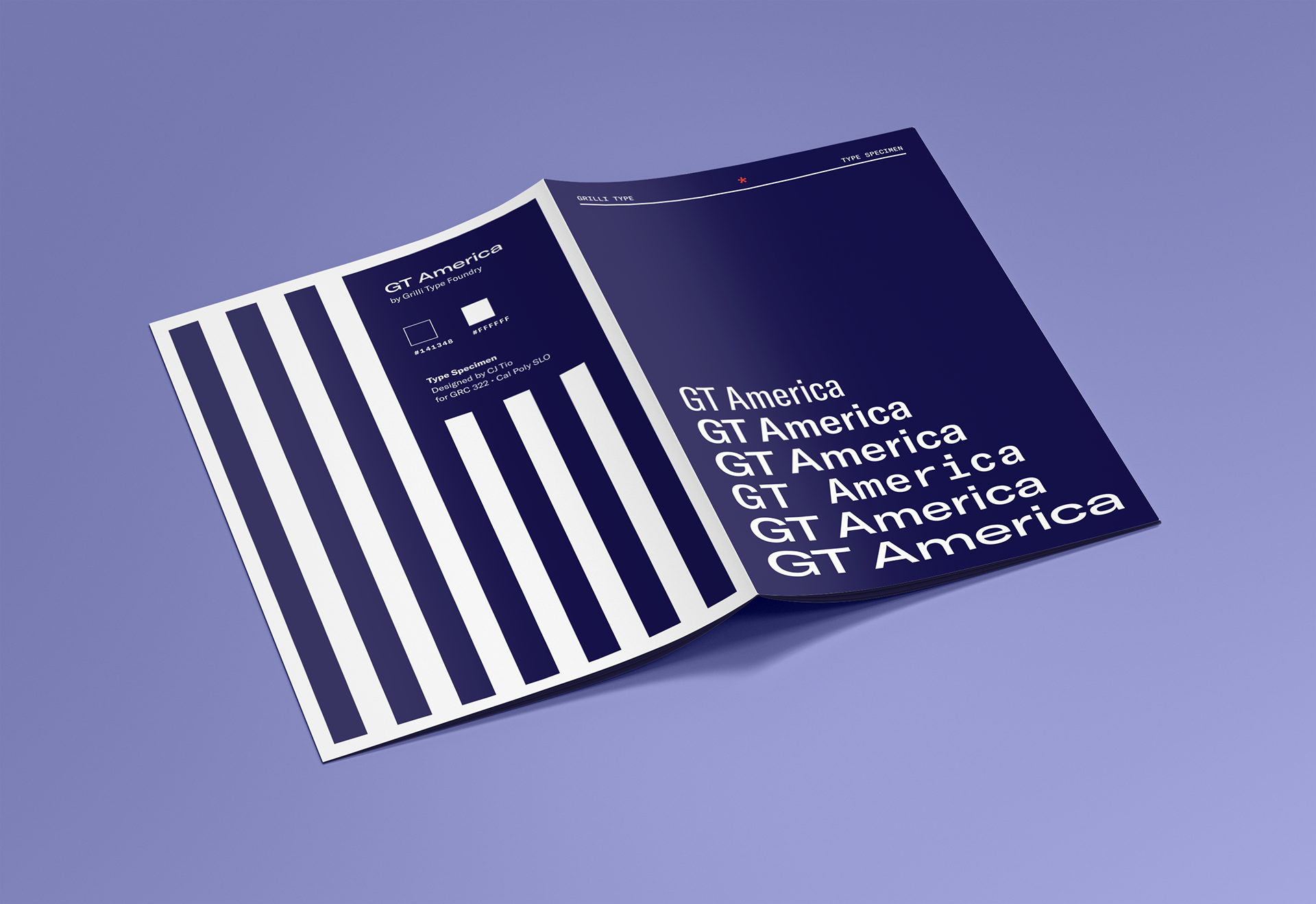
To develop the design direction of my booklet, I created a moodboard to explore examples of GT America in use. I found that Grilli Type's type specimen for GT America employed a sort of "America-core" direction, using vibrant blues and reds and "freedom" motifs to showcase the typeface.
In other digital and print examples I found using GT America, I saw a common theme of versatility and boldness in their use of the typeface, many of which would use both the Standard and Monospaced styles in the same project.
In other digital and print examples I found using GT America, I saw a common theme of versatility and boldness in their use of the typeface, many of which would use both the Standard and Monospaced styles in the same project.
Diving in - 1st iteration
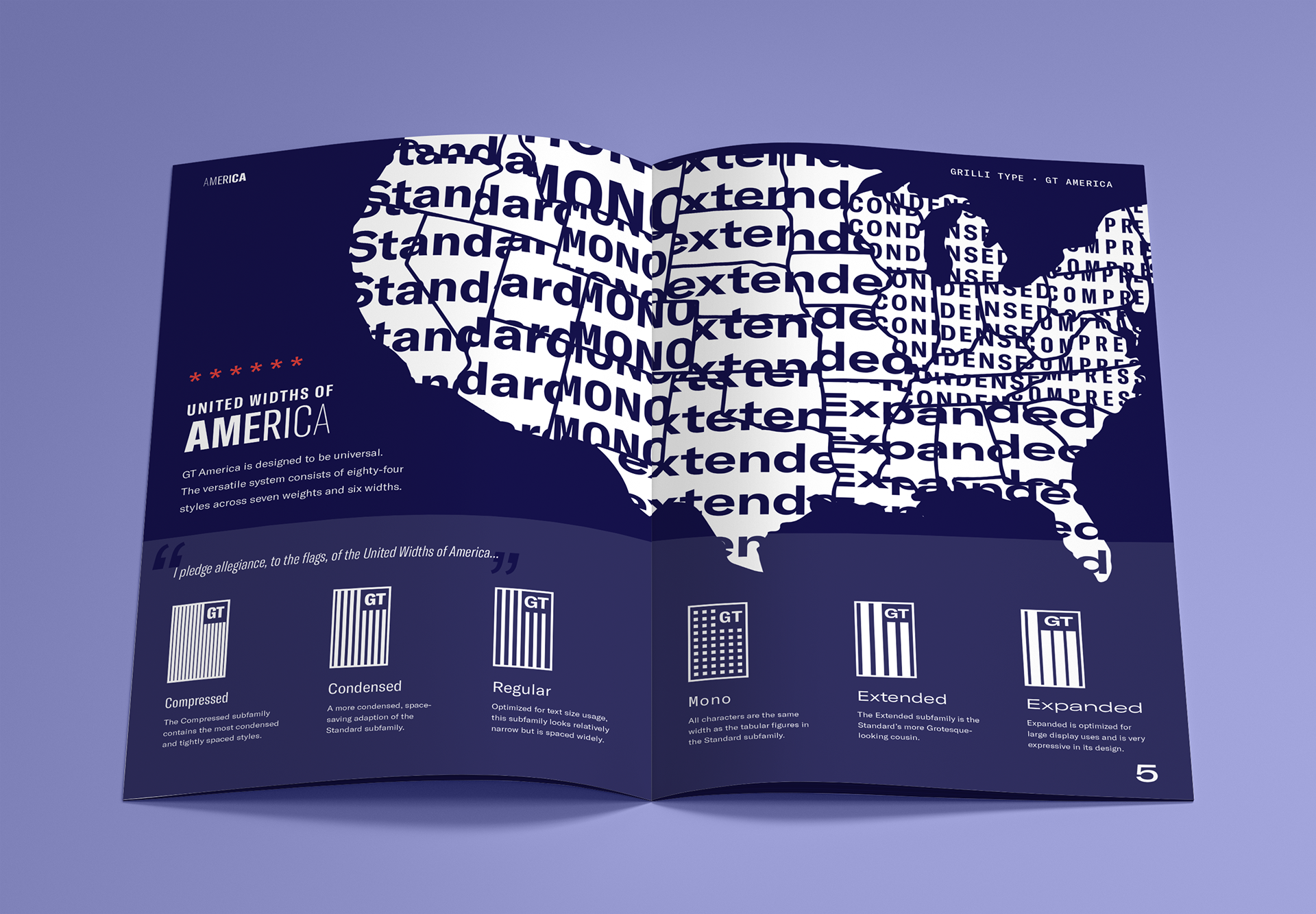
With my first iteration, I decided to focus on the versatility aspect of GT America and created American-style flags for each width of the typeface. Each flag uses stripes or rectangles to represent their respective widths, and under each flag is a short description explaining their characteristics.
On another spread, I created a few wireframe-style examples of GT America in use, ranging from a stack of political flyers to a t-shirt design for a family retreat.
Listening to feedback - 2nd iteration
Based on the feedback from my peers and my professor Bruno Ribeiro, I pivoted to a more cohesive (less "wireframe-y") motif and showed off the typeface in much bolder ways.
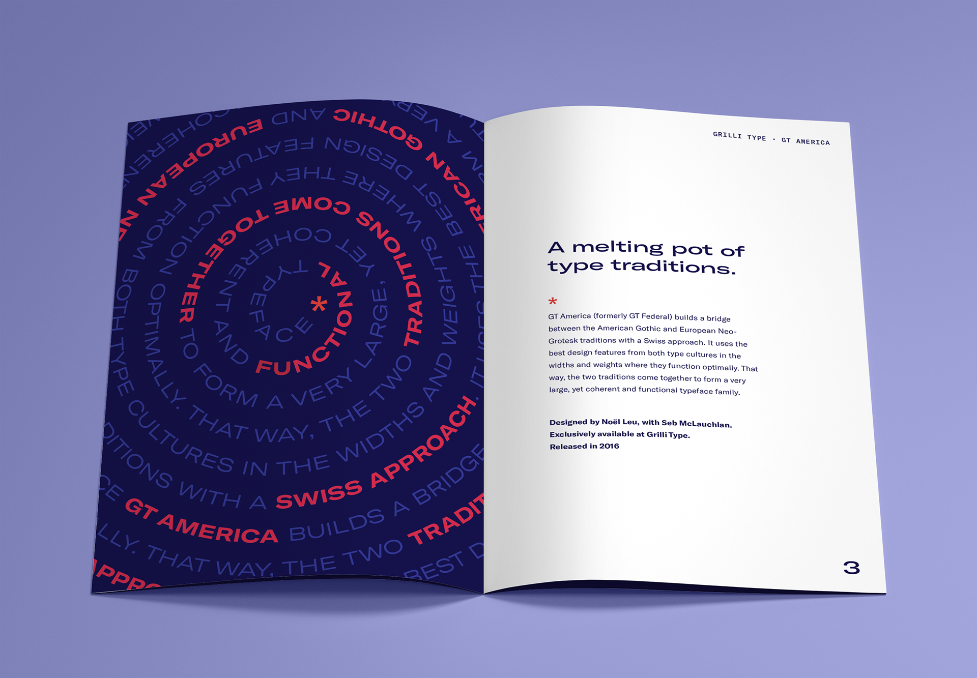
For one spread, I took the idea of the cultural "melting pot" and used it to lead the spread's copy on a spiral path. I highlighted the parts of the paragraph that describe the characteristics and origins of GT America using a bold weight and a bright red hue, contrasting with the blue body text.
I adjusted the layout of the "United Widths of America" spread to make room for a large vector-style map, featuring repeating titles of each GT America width superimposed on different regions of the United States.
Final touches - 3rd iteration
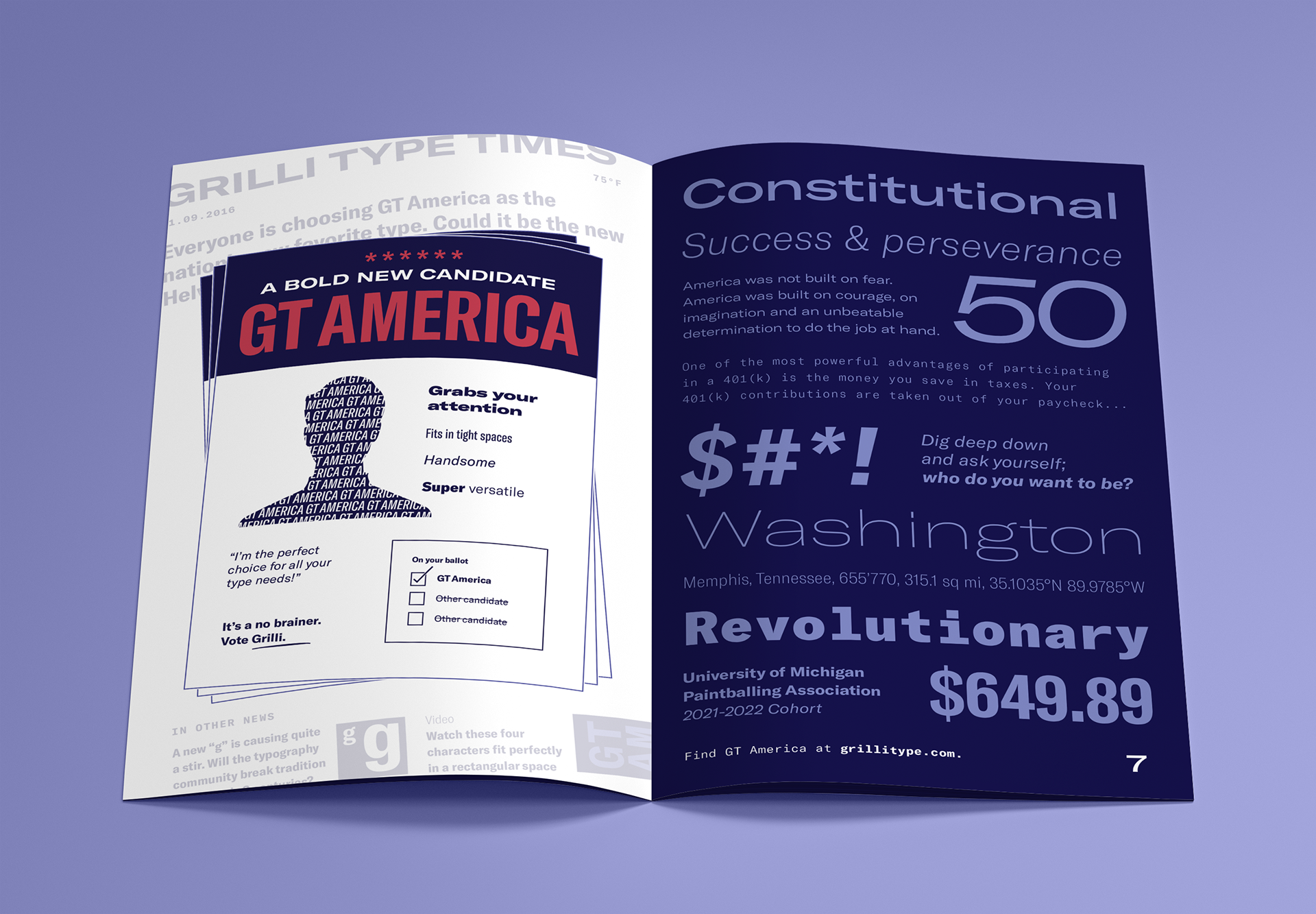
From another round of feedback, I decided to redesign the last spread on my booklet to provide a more focused showcase of the typeface rather than a smorgasbord of GT America in use.
I reused the political flyer graphic from my first iteration and made it the focus of page 6. Then on page 7, I pasted a variety of American themed words and phrases showcasing different combinations of GT America's widths and weights.
All set and ready to print!
After a few more adjustments to the layout, the booklet is now ready for print! I made sure that the InDesign document used a CMYK color space for print accuracy and included a 0.125in. bleed to ensure all pages with design elements that went all the way to the edge would appear as intended.
-
Tools used
Adobe InDesign for booklet creation
Adobe XD for moodboarding and wireframing
Adobe Photoshop for mockup creation
Tools used
Adobe InDesign for booklet creation
Adobe XD for moodboarding and wireframing
Adobe Photoshop for mockup creation
Project gallery
